This was one of my first projects at my current job, so I was debriefed about the company needs and goals by my colleagues since I'd missed the initial discovery call. They explained that Micron Medical creates small devices that are implanted in the bodies of people with urinary incontinence or chronic pain. The devices stimulate the nerve endings in order to help control their symptoms. Many end users would be elderly, so I kept this in mind throughout the design process.
Currently, the patients have no way of controlling the frequency and stimulation pattern of their implanted devices.
Micron Medical would be needing a mobile app to allow its patients to control their implanted medical devices. The frequency and stimulation of the device would dictate how frequently it stimulates the patient's nerves. This in turn results in a stronger or weaker control of the patient's symptoms.
To get a better idea of the project's requirements, I reviewed the documentation provided by my company's business analysts. The mobile and watch apps would allow patients to connect to an external transmitter, which in turn allows the phone or watch to control the implanted medical device.
Before jumping into the high-fidelity design, I reviewed the low-fidelity wireframes for the mobile app that my colleague had created in Miro. I imported portions of the Miro board and put them into Adobe XD to have close by for reference while I worked.

I next selected the typography and colors I would be working with. I wanted to ensure elderly patients could easily ready and see the screens, so I opted for Roboto, since it's a clear and readable Google font that works well across a range of devices.
This is an app that users would be needing to use frequently throughout the day, so I wanted it to have a very minimal and usable design, devoid of visual clutter.
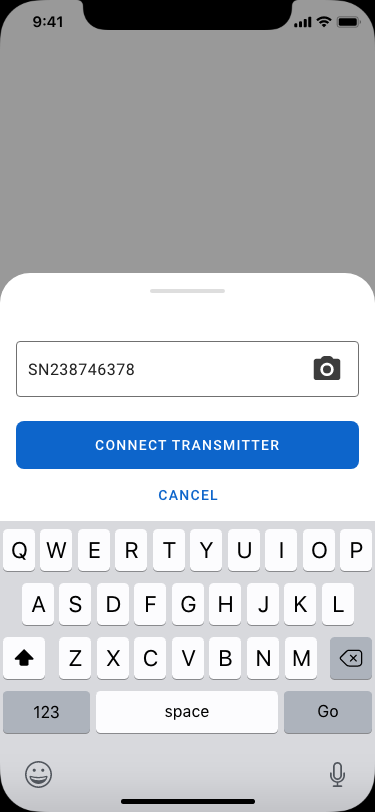
These screens display the process of connecting your mobile device to the transmitter, which occurs after registration.


Given that users may not know the meaning of these terms yet, I ensured there were information icons located near the terms they correspond to. Upon clicking, there is a tooltip that explains the functionality.
Designing the calendar for the diary tab was challenging for two reasons: 1. I wanted users to know they could adjust the weeks shown in the calendar, and 2. I wanted users to be able to switch months without having to repeatedly click "previous".

Dropdown for changing the month, arrows for changing the weeks. Could be misleading; week and months controllers are at the same level.

Descriptive buttons for changing weeks. Week and month controllers are now at different levels.


I designed the watch app using the official watch UI elements provided by Apple. I selected the smallest watch screen to design for. This way, I wouldn't need to worry about fitting design elements into a smaller screen later on (similar to benefits of the "mobile first" approach).
Although usability testing was not in the scope of this project, I had doubts about whether users would know how to adjust the power index, so I quickly sent a text to my friend who has an Apple Watch with an image of the power index screen. I asked what she would do in order to set the power index to 20. She said she would "scroll to change it to 20."
This was my first time designing an app for an Apple Watch and I learned a lot doing that. Specifically, that it's important to design for the smallest screen possible first. I also learned that unlike mobile phone designs, it's ok to leave as little as 1 px margin between the design elements and the edge of the screen! This is because Apple Watches have a curved bezel around the functional part of the screen, so there is no abrupt cut-off around the edge of the screen.
I also learned about the possible methods to change values and input information into a watch app design: tapping simple buttons (for yes or no and multiple choice questions), as well as turning the physical Apple Watch dial to adjust a numerical slider.
Now that the MVP has been designed, I'd love the opportunity to conduct usability tests for the mobile and watch apps to get valuable user data and determine ease of use.