Classic.com features a database of past and present classic car auction listings. Users can browse listings, and explore car markets. A car market is a group of cars (e.g. Chevrolet El Camino — from 1959–1960). Classic.com also has graphs displaying the past auction sale prices of cars within a given market. The site also provides CMVs (Classic.com Market Values), for various cars which is based on recent sale prices.

The Classic.com CEO requested an optimized user experience for site visitors. He also expressed future plans for a customized feed, similar to Instagram. I wanted my design to be scalable to the business future goals.
To kickoff my research, I interviewed the CEO to get in idea of his business goals. I also consulted with the head of marketing to determine what users were asking in the site's help chat. I learned that users were often asking how to purchase a certain car (but buying is not a supported function on the website).
I then assessed online competitors. I explored the sites and read app store reviews to gain insight on what users find valuable. I created a competitive feature analysis to determine what features users have come to expect. The market positioning chart I made helped identify a blue ocean in the market.


I interviewed a classic car lover, then devised an online survey to post on classic car forums. I then conducted 4 more interviews, as well as did current-state usability testing of the website.
This revealed various issues, including lack of clarity of the call to action buttons. For instance, “Save Vehicle” leads to users receiving alerts of price updates and sale price for that specific VIN number, but users did not know they would receive updates; they thought they were simply saving the vehicle into a specified folder / area of the website.
Other users thought they would receive updates for cars similar to the one in the listing. Other issues discovered were lack of a “go” button alongside the search bar, as well as not coming across the market value graphs until having explored the website for quite some time. "Oh what is this, market prices? That's pretty cool," one user stated after having already explored the site for about 20 minutes.
The affinity map helped me organize my findings, and led me to visualize the importance users place on a car's appearance, and of seeing car photos online.

I then devised an empathy map and a user persona to better identify with the target users, and to organize goals and frustrations of the target users into one persona.


Then, I created the user journey map to visualize the users’ process navigating the site. The top 3 pain points were:
• difficulties searching / sorting listings,
• being unclear on the functionality behind saving a vehicle, and
• lack of clarity as to the site’s functions.

I devised “how might we” statements to help ideate solutions for these 3 pain points. This served to better guide my brainstorming.

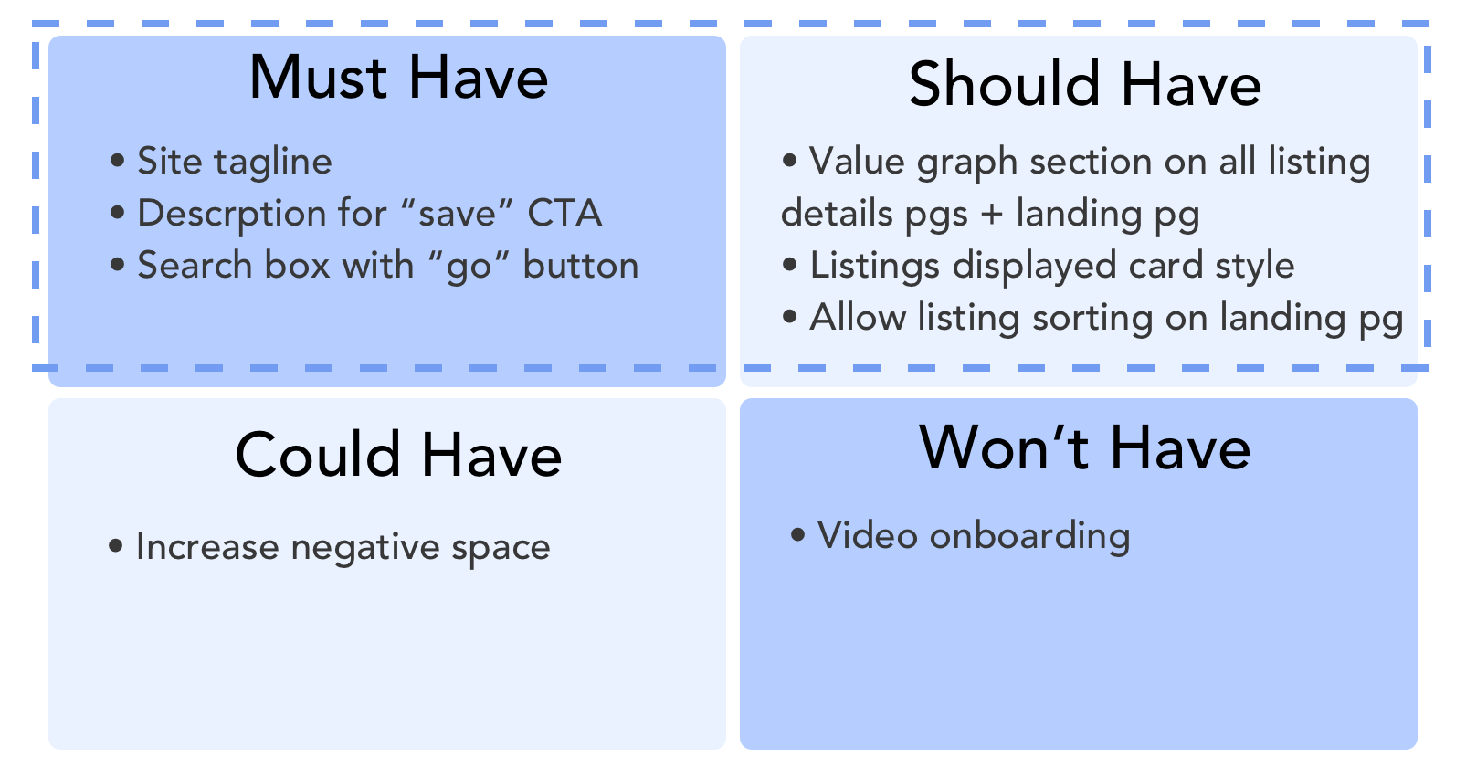
After ideating solutions, I used the MoSCoW method to prioritize ideas. This is important to prevent feature-overload and to give the company a better idea of what changes had a positive impact.

The minimum viable product is a responsive website with a site tagline, a description for the call to action buttons, a go button for the search bar, a market value graph on all car listing pages, listings displayed card style on the landing page, and a sorting functionality.
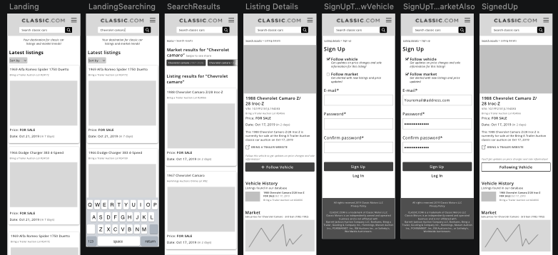
Once I’d arrived at the MVP, I created a user flow to determine what screens needed to be designed. I then sketched out paper lo-fi wireframes.

I then performed usability testing of the lo-fi prototype with 6 users, using Marvel and Maze. There was a 13.4% misclick rate and users described it as “intuitive.” Users did report confusion as to the featured market on the home screen. One user stated, “I don’t care about that market.” With this information, I omitted the featured market graph from the home screen in the next iteration.
Additionally, users reported that it made more sense to have the option to save a vehicle above the option to follow a market.

In this iteration, users were presented with the option to check “follow market,” which would result in them receiving updates when new cars within that market are listed. After testing, I discovered that the wording of “follow market” was didn't communicate the function to receive updates when new cars are listed.
Some users stated that they didn’t read the description below the “follow market” option. For the next iteration, I changed the wording to “new listing alerts.”
Before creating the hi-fi screens, I reviewed the UI and branding choices of competitors. Hagerty has a sleek and minimal look which aligned with Classic.com’s CEO’s vision for their site. Hemmings, on the other hand, features bold use of color and a stylized logo.
Using this information, I determined the desired brand attributes to help guide creation of the mood board: Sleek, clean, transparent, modern, dependable, and value.

The words that this mood board conjured in desirability testing were: Classy, modern, aesthetic, clean, structured, techy, and industrial.
I then created a style tile to represent some of the visual elements that would be on the website.

It was described by users as: minimal, organized, straightforward, bright, clean, classy, modern, facebook-y, industrial, clean, modern, and friendly.
I was pleased with the way the style tile performed during usability testing, so I continued on to create the visual design guide.

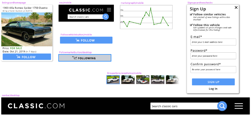
Some of the hi-fi screens for desktop and mobile can be seen below. The card style listing layout on the homepage lends itself well to the stakeholder's goals of customizing the feed.


Success and failure metrics for this design are the amount of users who follow cars and markets.
This project highlighted the importance of flexibility in design. Usability testing of each iteration resulted in pivoting my design to better meet user needs and help them achieve their goals.
This process highlighted importance of UX copy- users had different expectations when saving vs liking vs following a car.
It's crucial to ensure the product's functionality is meeting user expectations.
My next steps are to explore the need for search filters, auto correct / search suggestions, and a customized feed based on user activity.