Brief: I was challenged to add a feature to an existing mobile app while following the existing visual design guidelines. I choose to add a feature to the Yelp mobile app. Yelp is a company that lets people write and read reviews on a variety of business types, mostly dining and shopping businesses.
After conducting discovery research to identify the problem space, I added a current wait time feature to let users report current restaurant wait times, and to filter search results to find places to eat with an acceptable wait time.
Tools: Sketch, Adobe Illustrator, Marvel, Maze, InVision
.png)


I first conducted research on Yelp and its competitors in order to compare features offered, as well as to see where Yelp currently falls in the business landscape.
Yelp has several competitors- mainly Google Reviews. I learned about the various features offered by competitors and tracked them on a competitive feature analysis chart to learn where Yelp had room for improvement. This process also helps to determine what features users come to expect from similar businesses.
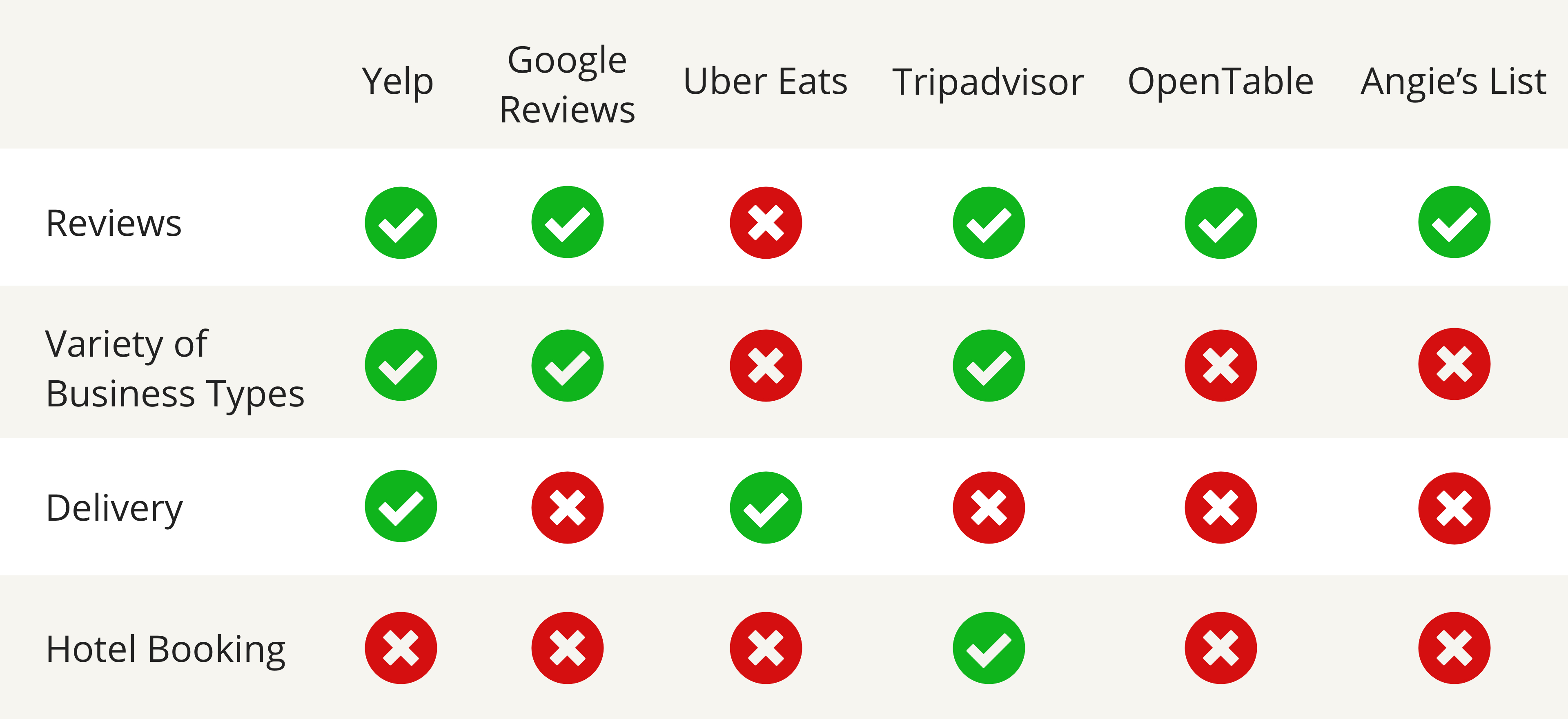
I then created a market positioning chart to unveil the potential blue ocean for Yelp. I plotted Yelp and the competitors based on how many features are offered, and how much business variety is on the platform.

I then conducted more specific internet research on Yelp to uncover habits and pains. Primarily, users found they had a large number of businesses they'd bookmarked but never categorized. Some users compained about the "Get Directions" functionality only working with Apple Maps.
I next conducted interviews with 5 Yelp users. They all mainly use Yelp for finding places to eat. It was challenging to receive information on pain points; the only pain users were mentioning was that the quality of photos could use improvement. I then tried broadening my interview questions.
The main pain point users mentioned was waiting a long time to be seated or to receive their food. One user stated, "I hate waiting! Usually when I go out to eat, I'm already pretty hungry."
I used the value proposition canvas, which helped me organize findings, identify jobs to be done, & get a good idea of market-fit. Given that Yelp is a mature product, I found more value in devising a job story to address the main user pain, rather than creating a user persona.
The job story that guided my brainstorming is:
When users need to decide on a place to eat, they want to find a good option with a minimal wait time so that they can have a satisfying, positive experience.

I devised “How Might We?” statements, then began to ideate solutions. Once I’d generated various ideas, I selected the ones that would best solve user pains and plotted them onto an impact vs effort chart.

The solution is a feature that displays current restaurant wait time to be seated, and that lets users filter search results to display only wait times they are comfortable with. The wait times will be self-reported by Yelp users currently at the restaurant. To incentivize submitting wait times, each submission will help the likelihood of achieving Yelp “elite” status.
I then created the user flow, which mapped out all screens and decisions the user would encounter while navigating the happy path through the product. This enabled me to create the lo-fi prototype with all the required screens.

My next step was to sketch out lo-fi wireframes, the main screens are shown in the photos below.

I prototyped the lo-fi wireframes in Marvel, then did usability testing with Maze. I tested with 6 users, while sitting beside them so I could hear their comments and notice any troubles. Users felt the scroll picker format to filter search results was intuitive, so I kept the same format for the mid-fi wireframes.

Some users wanted to arrive at the Italian restaurants screen via a different route than the one prototyped: “I would just prefer to narrow it down to restaurants first, because if I type ‘Italian,’ then it’ll show me Italian bakeries and grocery stores and stuff.” This is a prime example of the importance of research and usability testing- users’ mental models often don’t reflect our own!
One user tried to scroll the max wait bar rather than click directly on the “20 minutes” area (this would have led to success in the real product). Some users also wanted to sort the search results, rather than to filter them. This provided valuable information; users should have the option to sort (and not just filter) results by wait time.
Before moving on to complete the hi-fi prototype, I devised a design inventory using atomic design. Small components such as icons, typographic choice and size, and colors are considered atoms. Atoms combine to form molecules, which further combine to form organisms. This ensures efficiency when it comes time to develop the design (because the code for the various elements can be re-used).
I followed the style guidelines on Yelp’s branding page to maintain consistency with the existing app.

I then finalized the hi-fidelity prototype, with the changes I made after having tested the mid-fi prototype.
Completion of this project left me with two main take-aways. Firstly, it’s important to create hotlinks for all areas on the screen which a user could click and still get to the desired result. This is important to get a more accurate misclick rate.
Secondly, sometimes we need to go broad when asking questions and approaching solutions through design. Asking about frustrations with the Yelp app yielded only quite minor complaints. It was only went I went broad by stepping back and asking about pains when dining out in general that I started learning about more major user pain points. Amazingly, design & technology have the potential to solve very non-technical, real-life problems (like waiting a long time for your food!)
Success to evaluate success of this feature include rate of users sorting and filtering by wait time, as well as time to task completion. My next steps are to prototype the path a user would take to report a current restaurant wait time.